Chart patterns are the most fundamental thing in technical analysis.
Here we will learn the most profitable chart patterns that can skyrocket your earnings. Whether you’re new or experienced, these patterns are your key to success.
Chart patterns are graphical representations of price movements in financial markets, usually depicted on a price chart.
Traders and analysts use these patterns in technical analysis to identify potential future price movements and make informed trading decisions.
Identifying profitable chart patterns is essential for successful trading. These patterns help find entry and exit points, reflect market psychology, aid in risk management, and form the basis for trading setups and strategies.
They have historical reliability and can increase the probability of successful trades. However, it’s important to use chart patterns in conjunction with other analyses and be aware of the risks involved in trading.
We can conclude chart patterns into two categories- Reversal Patterns and Continuation Patterns
Reversal Patterns:
Reversal patterns are specific formations on a price chart that indicate a potential change in the direction of a prevailing trend.
They serve as signals for traders that a trend reversal might be occurring. These patterns suggest that the current trend, whether it’s going up or down, may be coming to an end, and a new trend in the opposite direction could be starting.
Reversal patterns are important because they help traders identify potential turning points in the market.
By recognizing these patterns, traders can anticipate when a trend is losing momentum and prepare to take advantage of the new direction that might emerge.
Reversal patterns can provide early indications that the existing trend is weakening and that it might be a good time to consider changing one’s trading strategy.
These patterns can take different forms, such as a double top/bottom, head, and shoulders.
Each pattern has its unique characteristics, but they all share the common purpose of suggesting a possible trend reversal.
Traders analyze these patterns and use them in conjunction with other indicators to confirm the reversal and make informed trading decisions.
It’s important to note that while reversal patterns can be reliable indicators, they are not foolproof guarantees of a trend reversal.
Traders should always consider other factors, such as market conditions, volume, and additional technical indicators, to increase the accuracy of their analysis and avoid making hasty decisions based solely on the presence of a reversal pattern.
Head and Shoulders
Description and formation of the pattern:
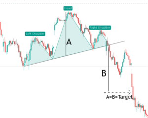
The Head and Shoulders pattern is a popular reversal pattern in technical analysis.
In this pattern, we can see three peaks, the middle peak is called the “head” which is higher than the other two peaks known as the “shoulders”.
The pattern is formed when the price reaches a high point (left shoulder), then declines, forms a higher peak (head), and then declines again, followed by a lower peak (right shoulder).
The lows between the shoulders are connected by a trendline called the “neckline.”
Significance and interpretation of the pattern:
The Head and Shoulders pattern suggests a potential trend reversal from bullish to bearish.
It indicates that the buying pressure is weakening, and the selling pressure may take over. When the price breaks below the neckline, it confirms the pattern and signals a possible downtrend.
Let’s say a stock’s price has been rising for a while, forming the left shoulder and head. Then, it rallies again but fails to surpass the previous peak and forms the right shoulder.
When the price breaks below the neckline, it indicates a potential trend reversal, and traders might consider taking a short position or exiting long positions.
Tips for effectively trading the Head and Shoulders pattern:
a. Confirm the pattern: Wait for a clear break below the neckline to confirm the pattern before taking any action.
b. Volume analysis: Observe the volume during the pattern formation. Typically, the volume should be higher during the left shoulder and head formation and lower during the right shoulder. Higher volume during the breakdown can further confirm the pattern.
c. Price target: Calculate the potential price target by measuring the vertical distance from the head to the neckline and projecting it downwards from the breakout point. This can help set profit targets.
d. Risk management: Place a stop-loss order above the right shoulder to limit potential losses if the pattern fails to confirm.
e. Consider additional indicators: Combine the Head and Shoulders pattern with other technical indicators, such as oscillators or trendlines, to gain more confirmation and increase the probability of a successful trade.
Remember, it’s essential to practice and gain experience in identifying and trading the Head and Shoulders pattern effectively.
Double Tops
Explanation of the pattern and its formation:
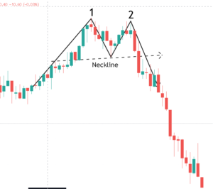
This pattern happens when the price goes up to a high point, then falls back down, and later tries to reach a similar high but fails.
It shows that the buyers are losing power, and the sellers may take control, indicating a possible trend reversal from an upward trend to a downward trend.
Interpreting the Double Tops pattern:
When you see a Double Tops pattern, it means the price tried to go higher twice but couldn’t break a certain level. This can be a sign that the trend may change from going up to going down.
Let’s say you notice a Double Tops pattern where the second peak doesn’t surpass the previous high.
You decide to sell (short position) and set a stop-loss order just above the second peak. If the price reverses as expected, you can make a profitable trade.
Double Bottoms
Explanation of the pattern and its formation:
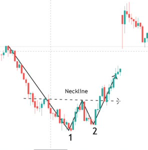
This pattern occurs when the price goes down to a low point, bounces back up, and then tries to reach a similar low but fails.
It suggests that the sellers are losing power, and the buyers may take control, indicating a potential trend reversal from a downward trend to an upward trend.
Interpreting the Double Bottoms pattern:
When you spot a Double bottom pattern, it means the price tried to go lower twice but couldn’t break a specific level.
This can indicate a possible shift in the trend from going down to going up.
In a Double bottom pattern, you observe the second trough failing to break the previous low.
You decide to buy (long position) and set a stop-loss order just below the second trough. If the price reverses as anticipated, you can make a successful trade.
Key considerations for trading the Double Tops and Double Bottoms pattern:
Confirmation: Look for additional signs that support the pattern, such as breaks in trendlines, specific candlestick patterns, or indicators showing a shift in momentum.
Volume: Ideally, there should be less trading activity during the pattern formation and an increase in trading volume when the price breaks out of the pattern. This can provide further confirmation.
Timeframe: You can choose a timeframe as per your viewpoint but understand one thing shorter timeframes may have more frequent but less reliable patterns compared to longer timeframes.
Remember, it’s important to study and practice the Double Tops and Double bottom patterns before using them in real trading. Developing a solid understanding will help you make more informed decisions.
Continuation Patterns:
Continuation patterns are shapes on a chart that show a short break or rest in an ongoing trend before it starts again.
These patterns play a vital role in identifying these pauses, allowing traders to recognize when a trend is likely to continue.
They confirm the trend’s direction and help manage trades effectively.
Continuation patterns help traders recognize periods of consolidation, indicating that market participants are taking a break and causing the price to move within a specific range temporarily.
By confirming the underlying trend’s strength and direction, these patterns provide traders with confidence to stay in their positions and avoid premature exits.
Additionally, continuation patterns offer entry opportunities for traders looking to enter trades aligned with the existing trend.
Examples of continuation patterns include flags, pennants, rectangles, and wedges, formed by consolidating price movements, decreasing volatility, converging trendlines, and diminishing trading volume.
While continuation patterns are valuable tools, they should be used alongside other technical analysis tools and considerations of market context, and risk management principles to make informed trading decisions.
Pennant Pattern:
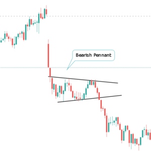
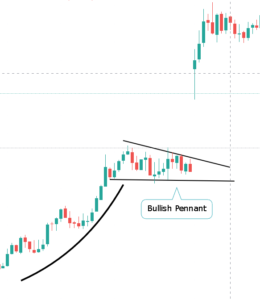
Formation: The pennant pattern forms when there is a strong, rapid price movement (known as the flagpole or the mast), followed by a period of consolidation characterized by converging trendlines.
Structure: The trendlines in a pennant pattern typically slope in the same direction, forming a triangular shape. The upper trendline connects the swing highs, while the lower trendline connects the swing lows during the consolidation phase.
Volume: Volume tends to decline during the consolidation phase and picks up again when the price breaks out of the pattern.
Target: Traders often project the target by measuring the flagpole’s length (the initial strong price movement) and adding it in the direction of the breakout from the breakout point. This projected distance can serve as a potential target level.
Stop Loss: A common approach is to set the stop loss just outside the pennant pattern, typically below the swing low (in an uptrend) or above the swing high (in a downtrend) that forms the boundary of the pennant.
Wedge Pattern:
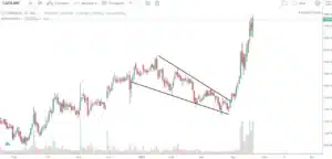
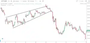
Formation: The wedge pattern forms when the price consolidates within converging trendlines, but unlike the pennant, the wedge pattern doesn’t require a preceding strong price movement.
Structure: Wedges can be either rising (ascending wedge) or falling (descending wedge). Rising wedges have upward-sloping trendlines for both the upper resistance line and the lower support line while falling wedges have downward-sloping lines.
Volume: Volume tends to decrease during the formation of the wedge pattern, indicating reduced participation, and may increase when the price eventually breaks out of the pattern.
Target: Similar to the pennant pattern, traders often use the wedge’s width (the widest part of the pattern) and project it in the direction of the breakout to estimate a potential target level.
Stop Loss: Traders typically place the stop loss just outside the wedge pattern, beyond the trendline that has been broken or violated.
Triangle Pattern:
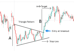
Formation: The triangle pattern occurs when the price consolidates between converging trendlines, forming a triangular shape. There are three main types of triangle patterns: ascending triangle, descending triangle, and symmetrical triangle.
Ascending Triangle:
The upper trendline is horizontal, connecting the swing highs, while the lower trendline is upward-sloping, connecting the higher swing lows.
Descending Triangle:
The lower trendline is horizontal, connecting the swing lows, while the upper trendline is downward-sloping, connecting the lower swing highs.
Symmetrical Triangle:
Both the upper and lower trendlines slope towards each other, creating a pattern with no clear horizontal tilt.
Volume: Volume tends to diminish as the price moves towards the apex of the triangle and often expands when the price eventually breaks out of the pattern.
Target: The target for a triangle pattern can be projected by measuring the height of the triangle (the distance between the high and low points) and adding it from the breakout point in the direction of the breakout.
Stop Loss: Traders often set the stop loss below the swing low (in an ascending triangle) or above the swing high (in a descending triangle) that defines the triangle’s boundary.
Flag Pattern:
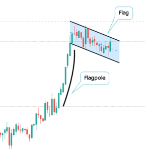
Formation: The flag pattern is a short-term consolidation that occurs after a strong price movement (known as the flagpole) and takes the shape of a rectangle or a parallelogram.
Structure: The flag pattern consists of two parallel trendlines—the flagpole represents the initial strong move, and the flag portion represents the consolidation. The flag pattern can be either a bullish flag or a bearish flag, depending on the preceding price trend.
Volume: Volume tends to decline during the flag portion, indicating a slowdown in trading activity, and may increase when the price breaks out of the pattern.
Target: Traders often use the flagpole’s length (the initial strong price movement) and project it in the direction of the breakout to estimate a potential target level.
Stop Loss: The stop loss for a flag pattern is commonly placed below the low of the flag portion (in a bullish flag) or above the high of the flag portion (in a bearish flag).
It’s crucial to note that these target and stop-loss levels are not guaranteed to be reached, as price action can be influenced by various market conditions.
Traders should consider their risk tolerance, market volatility, and other supporting technical indicators when determining specific target and stop-loss levels for these patterns.
Additionally, adjusting stop losses and taking partial profits along the way can be effective risk management strategies.
Conclusion
As the price moves, it forms patterns on the chart, so we learn to understand these patterns through technical analysis.
Continuous learning and practice are key to increasing your chances of success. Take the time to study different chart patterns, familiarize yourself with their formations, and observe real-life examples.
Additionally, consider backtesting historical data to validate the performance of your chosen patterns and trading strategies.

